
How a nurse practitioner’s mission became a brand that explains itself
The starting point:
Glen Ordinario is a family nurse practitioner in California; Yale-trained, board certified, with over 10 years managing conditions linked to obesity. Years in kidney care showed him where those conditions end up, and that’s why he does this work.
He was launching a telehealth practice for medication-based weight loss and metabolic health.
He knew exactly why. What he didn’t have was a clear way to say it, or a brand to hold it together.
The differentiator:
Many weight-loss services put intermediaries between the patient and the prescriber. With Glen, every session is with him, from the first assessment to every follow-up.
His starting point is biology, not willpower: heredity is not destiny.
The brand had to carry both things. Clinical credibility, and the supportive, non-judgemental tone he wanted patients to feel.
What I did:
- Brand strategy: values, tone of voice and communication approach
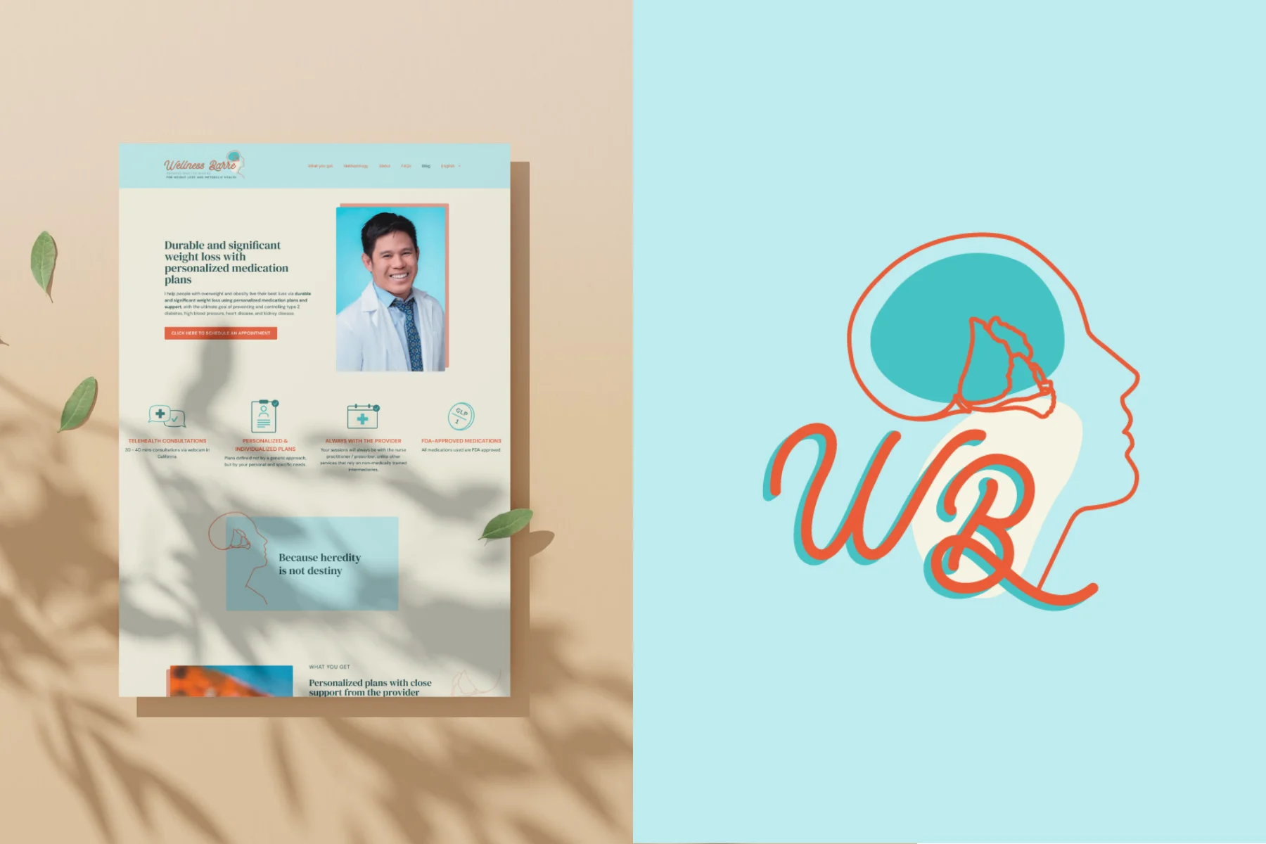
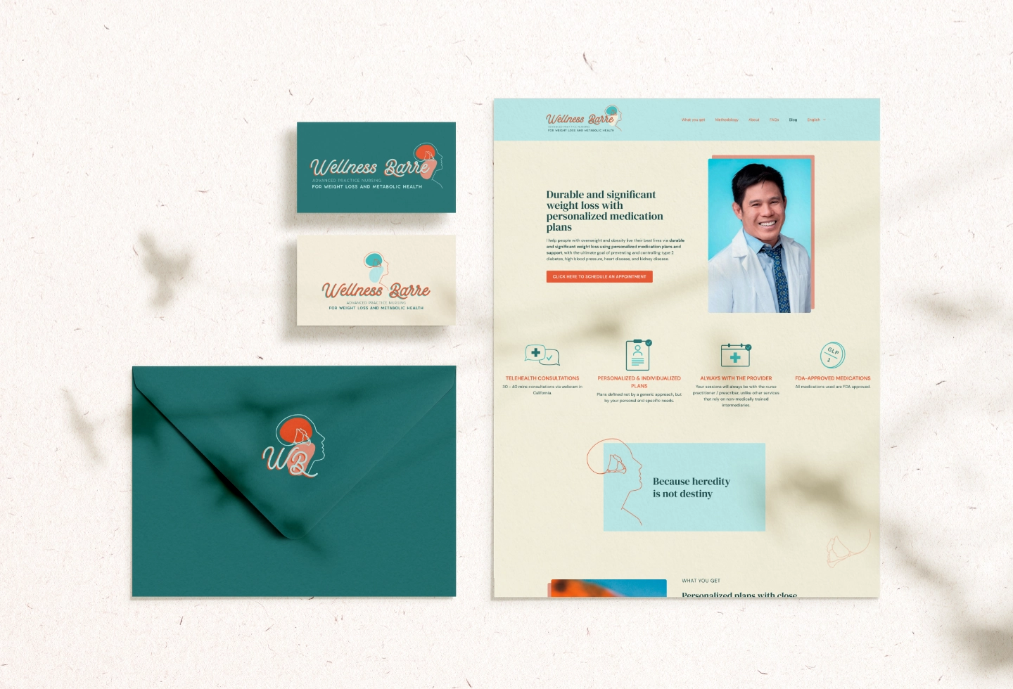
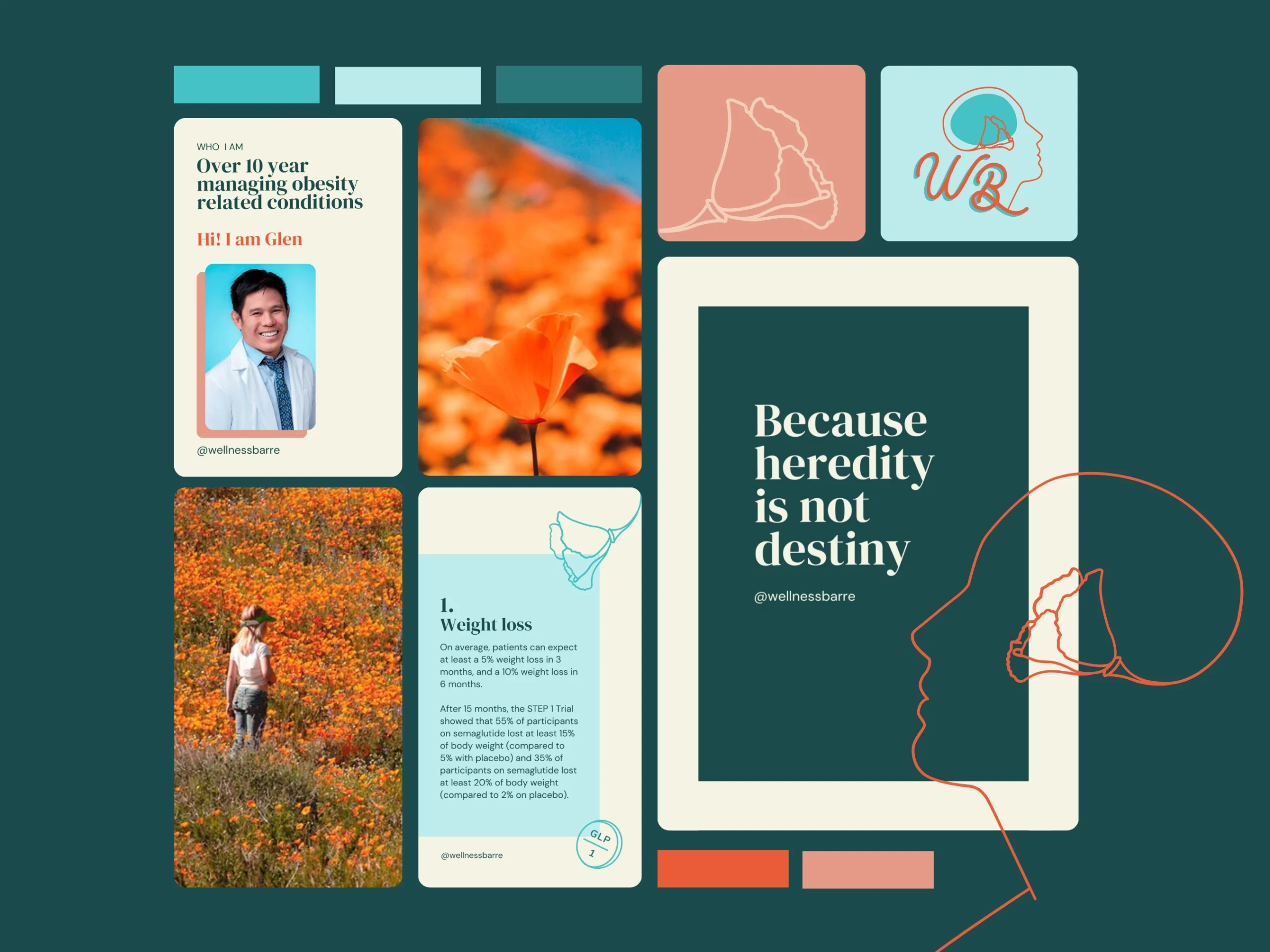
- Visual identity, built around the California poppy
- Art direction and image selection
- Content hierarchy: working from his copy, I decided what to highlight, chose the headlines and wrote some of them
- WordPress website, designed and built so he could manage it himself
- Full Spanish version of the site
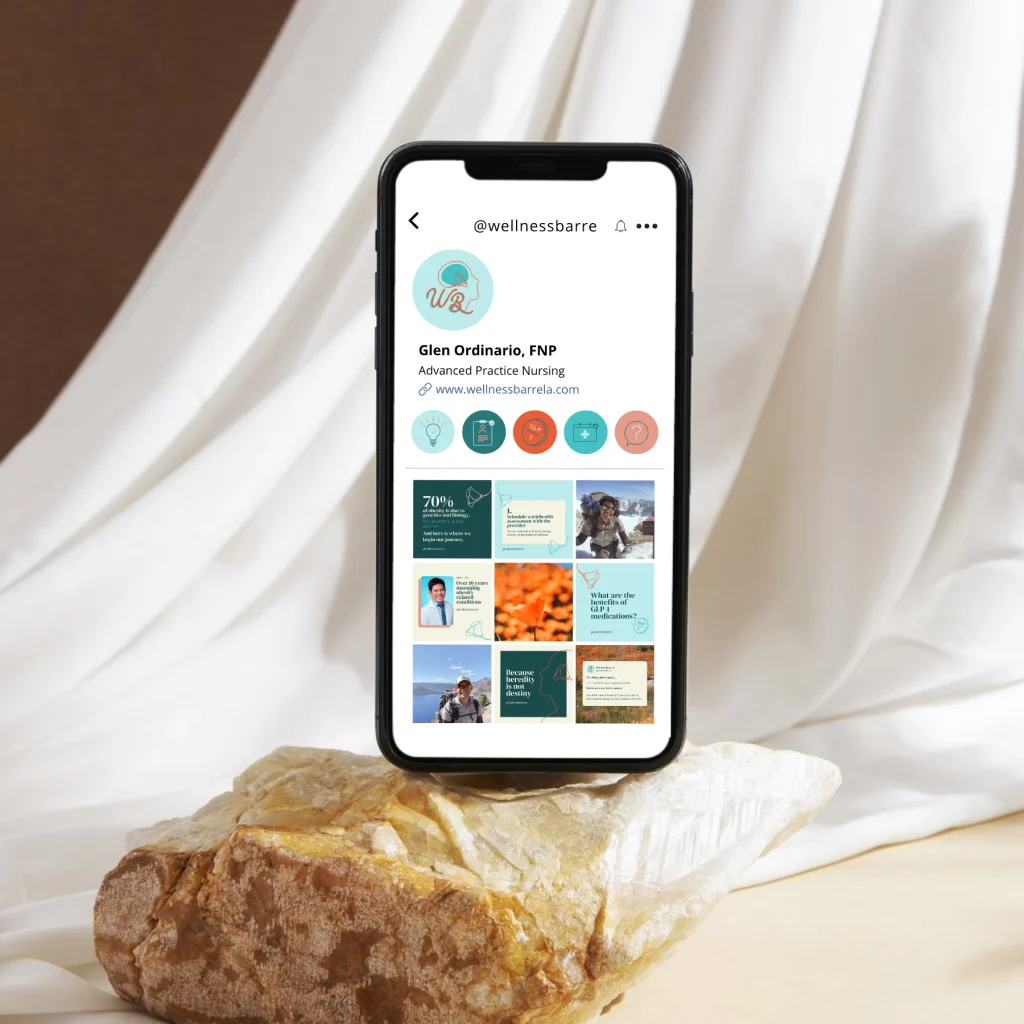
- Social media templates, posts and Instagram highlight icons
The outcome:
A bilingual brand that explains what Glen does before he has to. More than three years on, the site is still live with the identity I designed.
In his words: “Pilar was wonderful to work with!” He also told me how much he loved seeing the site in Spanish.
The mission was already there. The brand wasn't.
If your centre has real work behind it and a brand that still doesn’t carry it, let’s talk.
Book a 15-minute call and let’s see if it’s a fit.